This article shows a series of different plots and figures using the seaborn graphics library using color maps based on the colorspace package.
Scatterplot
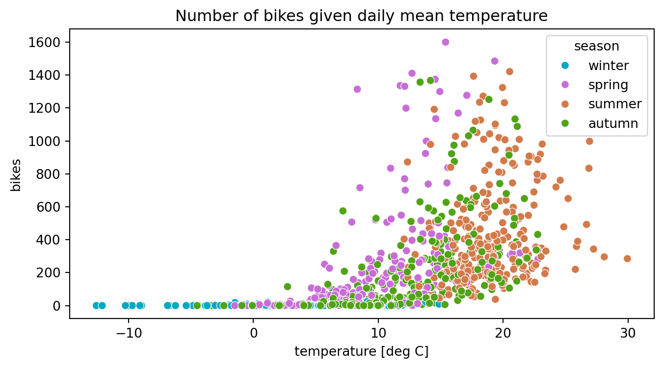
The following example shows the number of motorbikes recorded by an automatic traffic counting station in the Harz Mountains (Germany), an region very popular with bikers. The number of bikes (y-axis) is plotted against the daily mean temperature (x-axis) and colored by season using custom colors from a modified version of the HCL-based qualitative color palette “Dark 3”.
from colorspace import qualitative_hcl, dataset import matplotlib.pyplot as pltimport pandas as pdimport seaborn as sns# Loading HarzTraffic data setdf = dataset("HarzTraffic") # Palette (modified "Dark 3" sequential palette)pal = qualitative_hcl("Dark 3", h1 =-150, h2 =120)# Creating plotfig, ax = plt.subplots(1, 1, figsize = (8, 4))sns.scatterplot(data = df, x ="temp", y ="bikes", hue="season", ax = ax, palette = pal.colors(4))plt.title("Number of bikes given daily mean temperature")plt.xlabel("temperature [deg C]")plt.show()
Multi-group histogram
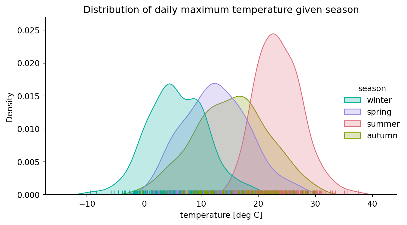
The next example shows a multi-group distribution plot (kind = "kde") based on the ‘HarzTraffic’ data set where the distribution of the daily maximum temperature is shown given the prevailing season. The colors are based on a modified sequential HCL-based palette using “Dark 3” as template (adjusting hues).
from colorspace import qualitative_hcl, datasetfrom matplotlib import pyplot as pltimport seaborn as sns # Loading penguins data setdf = dataset("HarzTraffic")# Palette to be usedpal = qualitative_hcl("Dark 3", h1 =-180, h2 =100)# Creating plotg = sns.displot(data = df, x ="tempmax", hue ="season", fill ="season", kind ="kde", rug =True, height =4, aspect =1.5, palette = pal.colors(4))g.set_axis_labels("temperature [deg C]") g.set(title ="Distribution of daily maximum temperature given season")plt.tight_layout()plt.show()
Heatmap
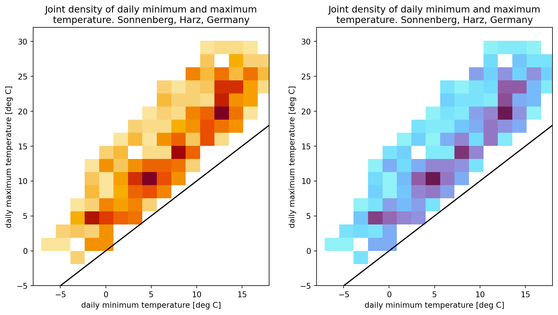
HCL-based color maps (LinearSegmentedColormap objects) can be used directly for seaborn heatmaps. The plot below shows the joint density of the daily maximum temperature (y-axis) and daily minimum temperature (x-axis) based on the ‘HarzTraffic’ data set.
The left subplot employs one of the pre-defined sequential HCL-based color palette “YlOrRd” (yellow-orange-red) in reverse order, while the right subplot shows the same information but using a custom sequential HCL-based palette. Instead of reversing the palette via rev = True, the .reversed() method on the LinearSegmentedColormap (cmap) is used to get the same effect.
from colorspace import sequential_hcl, datasetimport seaborn as snsimport matplotlib.pyplot as pltimport numpy as np# Loading penguins data setdf = dataset("HarzTraffic")# New figure with 2 subplotsfig, (ax1, ax2) = plt.subplots(1, 2, figsize = (12, 6))# Draw heatmap (left)g1 = sns.histplot(x ="tempmin", y ="tempmax", data = df, bins =25, pthresh =.1, ax = ax1, cmap = sequential_hcl("YlOrRd", rev =True).cmap()) g1.plot([-50, 50], [-50, 50], color ="black") # Adding diagonalg1.set(xlim = [-8, 18], ylim = [-5, 32]) # Re-adjusting limitsg1.set_xlabel("daily minimum temperature [deg C]") g1.set_ylabel("daily maximum temperature [deg C]") g1.set_title("Joint density of daily minimum and maximum\n"+"temperature. Sonnenberg, Harz, Germany")# Create fully customized HCL-based sequential palettecustom_cmap = sequential_hcl(h = [330, 170], c = [45, 70, 10], l = [25, 95], power = [0.5, 1.5]).cmap().reversed()# Draw heatmap (right) with customized color mapg2 = sns.histplot(x ="tempmin", y ="tempmax", data = df, bins =25, pthresh =.1, ax = ax2, cmap = custom_cmap)g2.plot([-50, 50], [-50, 50], color ="black") # Adding diagonalg2.set(xlim = [-8, 18], ylim = [-5, 32]) # Re-adjusting limitsg2.set_xlabel("daily minimum temperature [deg C]") g2.set_ylabel("daily maximum temperature [deg C]") g2.set_title("Joint density of daily minimum and maximum\n"+"temperature. Sonnenberg, Harz, Germany")plt.show()
Lineplot with multiple facets
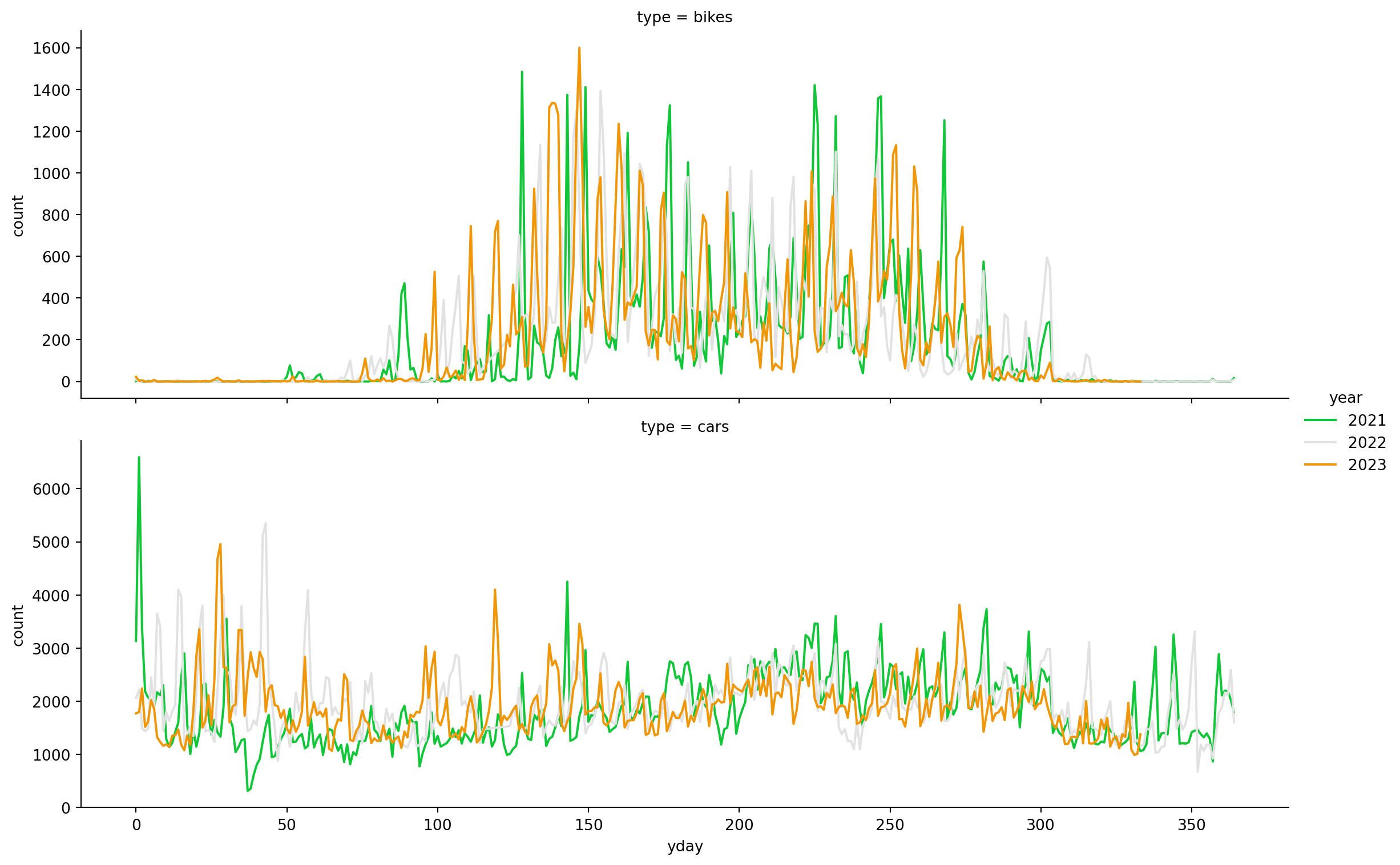
This example shows the number of bikes and cars for the different years by day of year (yday; Julian day) using a diverging HCL-based color palette.
from colorspace import diverging_hclimport matplotlib.pyplot as pltimport seaborn as snsimport pandas as pd# Loading penguins data setdf = dataset("HarzTraffic")df["year"] = pd.DatetimeIndex(df.date).year# Reorganizing the dataa = df.loc[:, ["year", "yday", "bikes"]].rename(columns = {"bikes": "count"})a.insert(2, "type", "bikes")b = df.loc[:, ["year", "yday", "cars"]].rename(columns = {"cars": "count"})b.insert(2, "type", "cars")# Concatenate (rowwise)df = pd.concat([a, b], axis =0)del a, b# Number of colors requiredN =len(np.unique(df.year))# Plot the lines on two facetssns.relplot(data = df, x ="yday", y ="count", hue ="year", row ="type", kind ="line", size_order = ["cars", "bikes"], height =4, aspect =3, facet_kws =dict(sharey =False), palette = diverging_hcl("Green-Orange").colors(N))plt.show()
Barplot
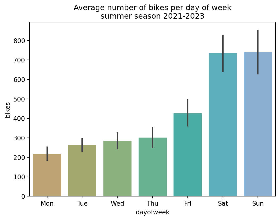
The Harz region in Germany is well known amongst bikers which often use their time on the weekend to go for a ride. To visualize this, the following barplot shows the average number of bikes (with error bars) during the summer seasons (June-August) 2021-2023 based on the “HarzTraffic” data set. The qualitative HCL-based color palette “Harmonic” is used to colorize the different days of week.
from colorspace import qualitative_hcl, datasetimport matplotlib.pyplot as pltimport seaborn as sns# Loading data setdf = dataset("HarzTraffic")df = df.loc[(df.season =="summer"), :]sns.barplot(x ="dayofweek", y ="bikes", hue ="dow", data = df, order = ["Mon", "Tue", "Wed", "Thu", "Fri", "Sat", "Sun"], legend =False, palette = qualitative_hcl("Harmonic").colors(7))plt.title("Average number of bikes per day of week\nsummer season 2021-2023")plt.show()
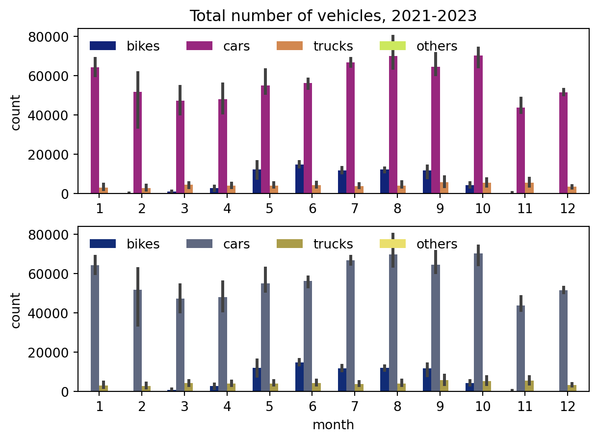
As a slightly more complex example, the visualization below shows grouped barplots with the total number of bikes, cars, trucks, and other vehicles registered on a monthly basis between January 2021 and November 2023, using the example data set The different vehicle types are colorized using the sequential HCL-based color palette “Plasma”. The upper plot shows original colors (no visual constraints), the lower simulates the same colors seen by people with deuteranope vision (green-yellow-red weakness).
from colorspace import sequential_hcl, dataset, deutanimport pandas as pdimport seaborn as snsimport matplotlib.pyplot as plt# Loading penguins data setdf = dataset("MonthlyHarzTraffic")# Reshaping the pandas DataFrameres = []for t in ["bikes", "cars", "trucks", "others"]: tmp = df.loc[:, ["year", "month", t]].rename(columns = {t: "count"}) tmp.insert(3, "type", t) res.append(tmp)df = pd.concat(res, axis =0)del res, tmp# New figurefig, (ax1, ax2) = plt.subplots(2, 1)#, figsize = (8, 6))# Plotting (unconstraint and deuteranope vision)sns.barplot(x ="month", y ="count", hue ="type", data = df, ax = ax1, palette = sequential_hcl("Plasma")(4))sns.barplot(x ="month", y ="count", hue ="type", data = df, ax = ax2, palette = deutan(sequential_hcl("Plasma")(4)))# Setting title, adjusting legendax1.set_title("Total number of vehicles, 2021-2023")ax1.set_xlabel(None)sns.move_legend(ax1, "upper left", ncol =4, title =None, frameon =False)sns.move_legend(ax2, "upper left", ncol =4, title =None, frameon =False)plt.show()