As motivated in the previous article (Color Spaces: Classes and Methods), the HCL space is particularly useful for specifying individual colors and color palettes, as its three axes match those of the human visual system very well. Therefore, the colorspace package provides three types of palettes based on the HCL model:
Qualitative: Designed for coding categorical information, i.e., where no particular ordering of categories is available and every color should receive the same perceptual weight.
Sequential: Designed for coding ordered/numeric information, i.e., going from high to low (or vice versa).
Diverging: Designed for coding ordered/numeric information around a central neutral value, i.e., where colors diverge from neutral to two extremes.
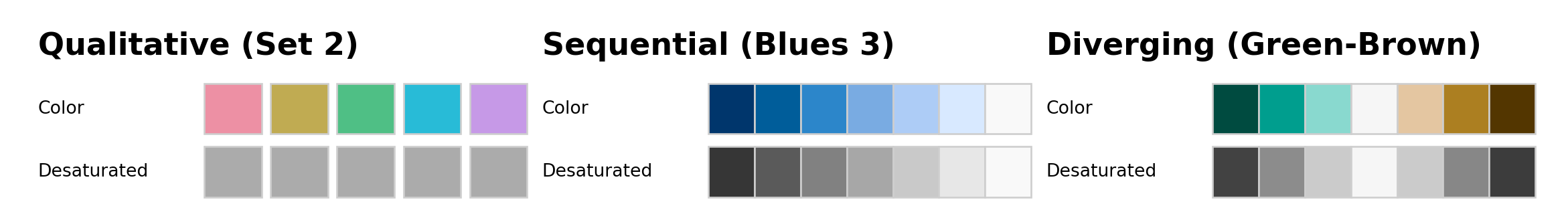
The corresponding classes are qualitative_hcl, sequential_hcl, and diverging_hcl. Their construction principles are exemplified in the following color swatches and explained in more detail below. The desaturated palettes bring out clearly that luminance differences (light-dark contrasts) are crucial for sequential and diverging palettes while qualitative palettes are balanced at the same luminance.
More details about the construction of such palettes is provided in the following while the article on Palette Visualization and Assessment introduces further tools to better understand the properties of color palettes.
To facilitate obtaining good sets of colors, HCL parameter combinations that yield useful palettes are accessible by name. These can be listed using the function hcl_palettes.
To inspect the HCL parameter combinations for a specific palette simply include the palette name where upper- vs. lower-case, spaces, etc. are ignored for matching the label, e.g., "set2" matches "Set 2" as well as "SET2" will.
from colorspace import hcl_palettespal = hcl_palettes().get_palette(name ="SET2")pal
Calling qualitative_hcl, sequential_hcl, and diverging_hcl respectively, will initialize an object of class hclpalette defined by a series of parameters which specify the color palette. All parameters can either be specified “by hand” through the HCL parameters, an entire palette can be specified “by name”, or the name-based specification can be modified by a few HCL parameters. In case of the HCL parameters, either a vector-based specification such as h = [0, 270] or individual parameters h1 = 0 and h2 = 270 can be used.
To compute the actual color hex codes (representing sRGB coordinates), the method .colors() is used to return a list of n colors along the coordinates defined by parameters specified when constructing the object.
The first three of the following commands lead to equivalent output. The fourth command yields a modified set of colors (lighter due to a luminance of 80 instead of 70).
from colorspace import qualitative_hclqualitative_hcl()(4)
qualitative_hcl distinguishes the underlying categories by a sequence of hues while keeping both chroma and luminance constant, to give each color in the resulting palette the same perceptual weight. Thus, h should be a pair of hues (or equivalently h1 and h2 can be used) with the starting and ending hue of the palette. Then, an equidistant sequence between these hues is employed, by default spanning the full color wheel (i.e., the full 360 degrees). Chroma c (or equivalently c1) and luminance l (or equivalently l1) are constants. Finally, fixup indicates whether colors with out-of-range coordinates should be corrected.
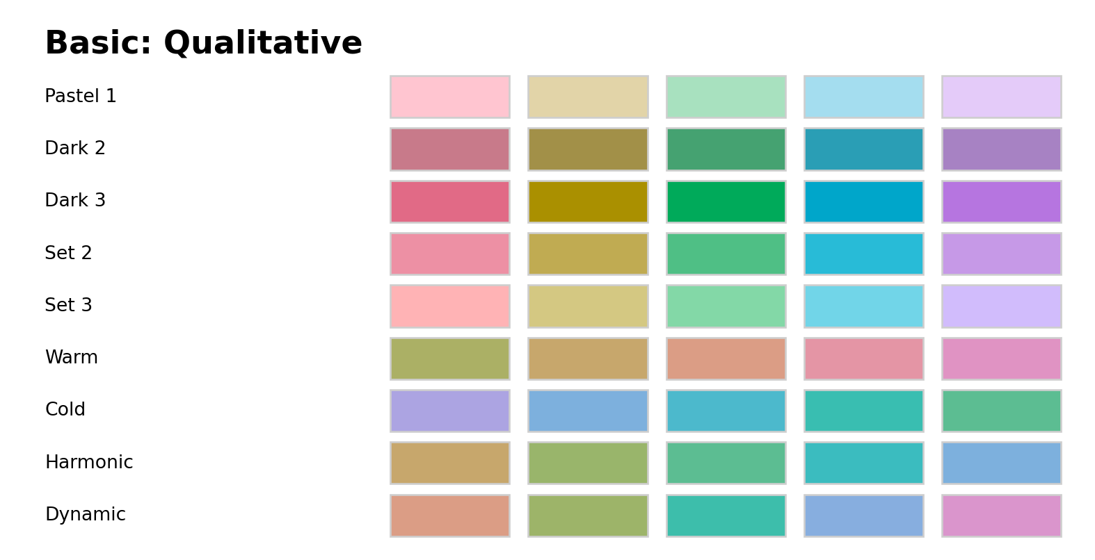
In the following graphic the available named palettes are shown. The first five palettes are close to the ColorBrewer.org palettes of the same name (Harrower and Brewer 2003). They employ different levels of chroma and luminance and, by default, span the full hue range. The remaining four palettes are taken from Ihaka (2003). They are based on the same chroma (50) and luminance (70) but the hue is restricted to different intervals.
When palettes are employed for shading areas in statistical displays (e.g., in bar plots, pie charts, or regions in maps), lighter colors (with moderate chroma and high luminance) such as “Pastel 1” or “Set 3” are typically less distracting. By contrast, when coloring points or lines, more flashy colors (with high chroma) are often required: On a white background a moderate luminance as in “Dark 2” or “Dark 3” usually works better while on a black/dark background the luminance should be higher as in “Set 2” for example.
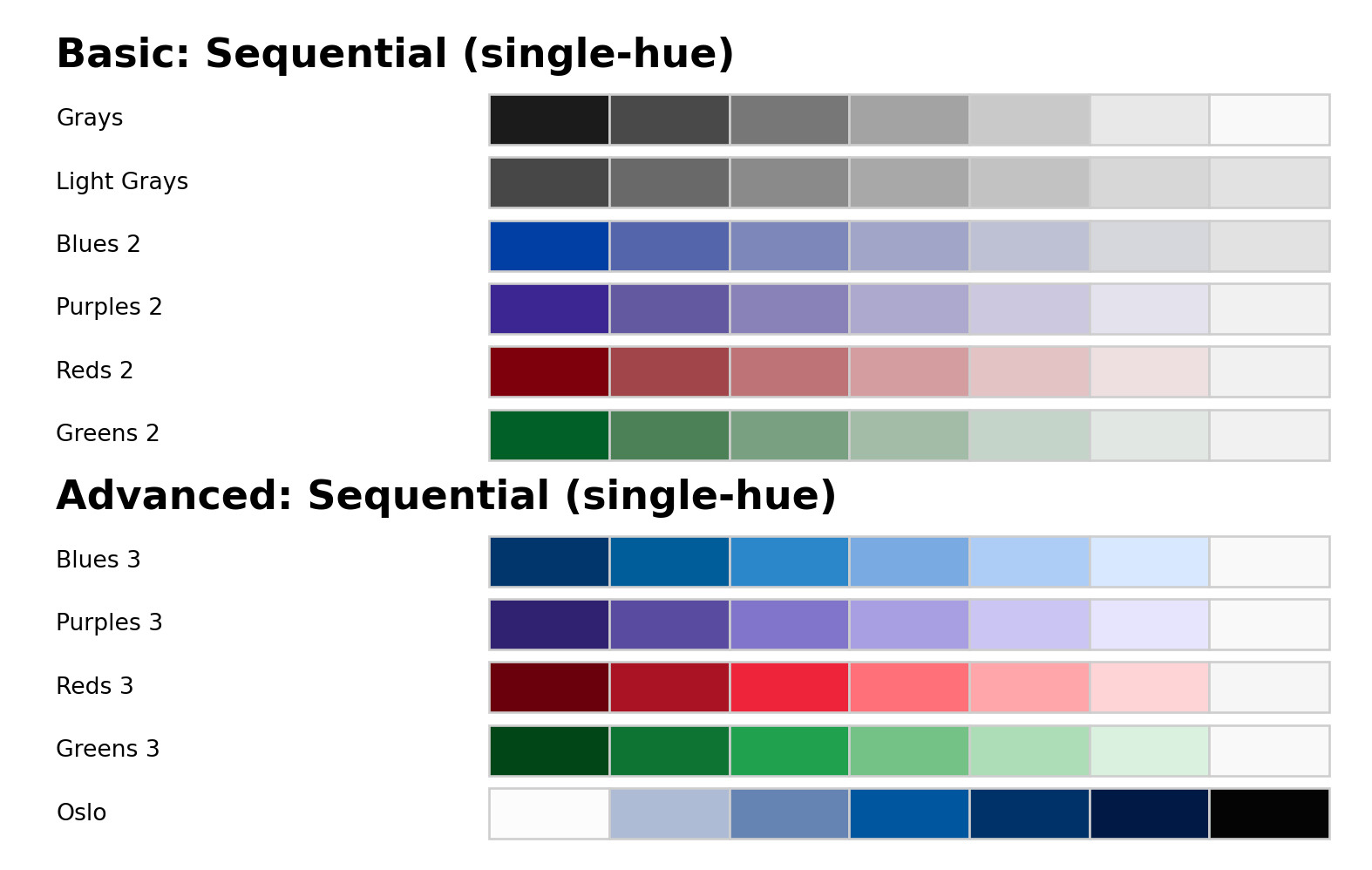
Sequential palettes (single-hue)
sequential_hcl codes the underlying numeric values by a monotonic sequence of increasing (or decreasing) luminance. Thus, the function’s l argument should provide a vector of length \(2\) with starting and ending luminance (equivalently, l1 and l2 can be used). Without chroma (i.e., c = 0), this simply corresponds to a gray-scale palette, see “Grays” and “Light Grays” below.
All except the last are inspired by the ColorBrewer.org palettes with the same base name (Harrower and Brewer 2003) but restricted to a single hue only. They are intended for a white/light background. The last palette (Oslo) is taken from the scientific color maps of Crameri (2018) and is intended for a black/dark background and hence the order is reversed starting from a light blue (not a light gray).
To distinguish many colors in a sequential palette it is important to have a strong contrast on the luminance axis, possibly enhanced by an accompanying pronounced variation in chroma. When only a few colors are needed (e.g., for coding an ordinal categorical variable with few levels) then a lower luminance contrast may suffice.
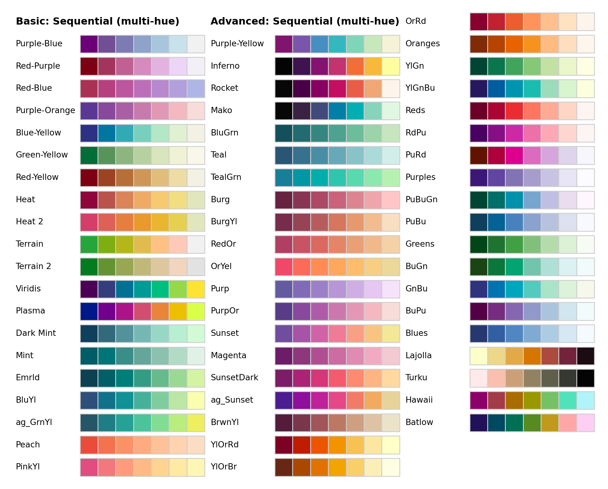
Sequential palettes (multi-hue)
To not only bring out extreme colors in a sequential palette but also better distinguish middle colors it is a common strategy to employ a sequence of hues. Thus, the basis of such a palette is still a monotonic luminance sequence as above (combined with a monotonic or triangular chroma sequence). But rather than using a single hue, an interval of hues in h (or beginning hue h1 and ending hue h2) can be specified.
sequential_hcl allows combined variations in hue (h and h1/h2, respectively), chroma (c and c1/c2/cmax, respectively), luminance (l and l1/l2, respectively), and power transformations for the chroma and luminance trajectories (power and p1/p2, respectively). This yields a broad variety of sequential palettes, including many that closely match other well-known color palettes. The plot below shows all the named multi-hue sequential palettes in colorspace which consist of various palettes created during the development of colorspace, e.g., by Zeileis, Hornik, and Murrell (2009) or Stauffer et al. (2015) among others.
In addition palettes are provided which closely match the palettes developed by Smith and Van der Walt (2015) for matplotlib, matching CARTO palettes (CARTO 2019), ColorBrewer.org palettes (Harrower and Brewer 2003), and palettes closely matching the scientific palettes by Crameri (2018).
Note that the palettes differ substantially in the amount of chroma and luminance contrasts. For example, many palettes go from a dark high-chroma color to a neutral low-chroma color (e.g., “Reds”, “Purples”, “Greens”, “Blues”) or even light gray (e.g., “Purple-Blue”). But some palettes also employ relatively high chroma throughout the palette (e.g., the viridis and many CARTO palettes). To emphasize the extremes the former strategy is typically more suitable while the latter works better if all values along the sequence should receive some more perceptual weight.
Diverging palettes
diverging_hcl codes the underlying numeric values by a triangular luminance sequence with different hues in the left and in the right “arms” of the palette. Thus, it can be seen as a combination of two sequential palettes with some restrictions: (a) a single hue is used for each arm of the palette, (b) chroma and luminance trajectory are balanced between the two arms, (c) the neutral central value has zero chroma. To specify such a palette a vector of two hues h (or equivalently h1 and h2), either a single chroma value c (or c1) or a vector of two chroma values c (or c1 and cmax), a vector of two luminances l (or l1 and l2), and power parameter(s) power (or p1 and p2) are used. For more flexible diverging palettes without the restrictions above (and consequently more parameters) see the divergingx_hcl palettes introduced below.
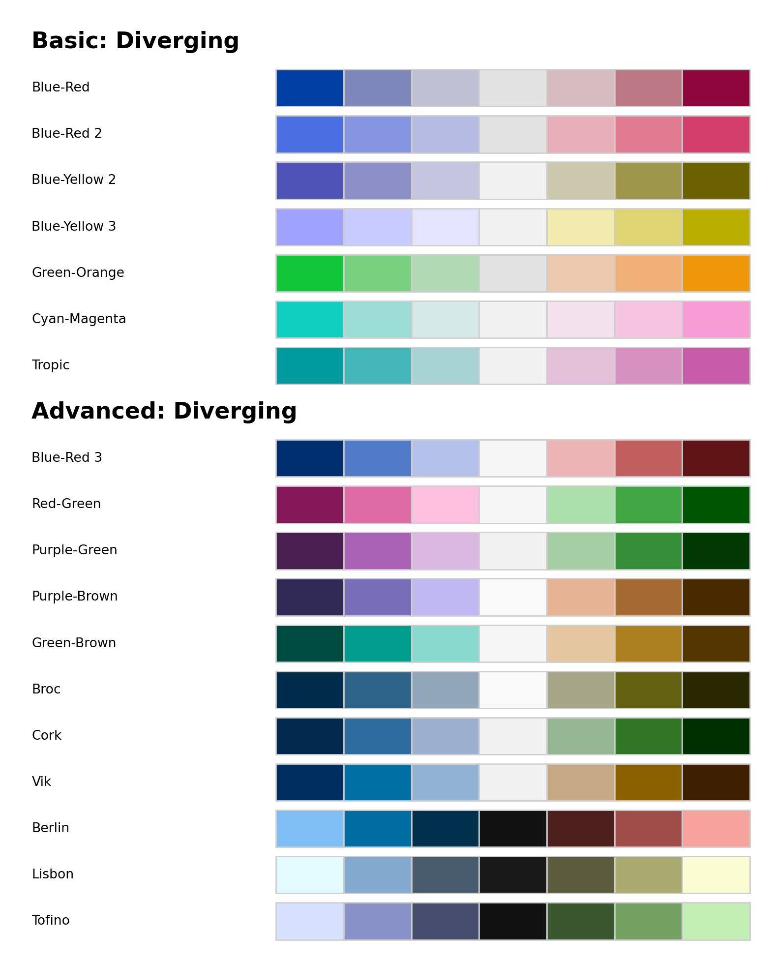
The plot below shows all such diverging palettes that have been named in colorspace available via the diverging_hcl class.
A series of these palettes have been developed for the R colorspace starting from Zeileis, Hornik, and Murrell (2009), taking inspiration from various other palettes, including more balanced and simplified versions of several ColorBrewer.org palettes (Harrower and Brewer 2003) “Tropic” closely matches the palette of the same name from CARTO (CARTO 2019), “Broc” to “Vik” and “Berlin” to “Tofino” closely match the scientific color maps of the same name by Crameri (2018), where the first three are intended for a white/light background and the other three for a black/dark background.
When choosing a particular palette for a display similar considerations apply as for the sequential palettes. Thus, large luminance differences are important when many colors are used while smaller luminance contrasts may suffice for palettes with fewer colors etc.
Construction details
The three different types of palettes (qualitative, sequential, and diverging) are all constructed by combining three different types of trajectories (constant, linear, triangular) for the three different coordinates (hue H, chroma C, luminance L):
Type
H
C
L
Qualitative
Linear
Constant
Constant
Sequential
Constant (single-hue) or Linear (multi-hue)
Linear (+ power) or Triangular (+ power)
Linear (+ power)
Diverging
Constant (2x)
Linear (+ power) or Triangular (+ power)
Linear (+ power)
As pointed out initially in this article, luminance is probably the most important property for defining the type of palette. It is constant for qualitative palettes, monotonic for sequential palettes (linear or a power transformation), and uses two monotonic trajectories (linear or a power transformation) diverging from the same neutral value.
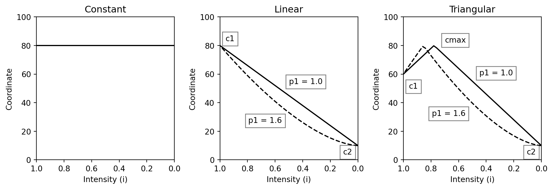
Hue trajectories are also rather intuitive and straightforward for the three different types of palettes. However, chroma trajectories are probably the most complicated and least obvious from the examples above. Hence, the exact mathematical equations underlying the chroma trajectories are given in the following (i.e., using the parameters c1, c2, cmax, and p1, respectively). Analogous equations apply for the other two coordinates.
The trajectories are functions of the intensity \(i \in [0,1]\) where \(1\) corresponds to the full intensity:
where \(j\) is the intensity at which \(c_{max}\) is assumed. It is constructed such that the slope to the left is the negative of the slope to the right of \(j\):
Instead of using a linear intensity \(i\) going from \(1\) to \(0\), one can replace \(i\) with \(i ^{p_1}\) in the equations above. This then leads to power-transformed curves that add or remove chroma more slowly or more quickly depending on whether the power parameter \(p_1\) is \(< 1\) or \(> 1\).
The three types of trajectories are also depicted below. Note that full intensity \(i = 1\) is on the left and zero intensity \(i = 0\) is on the right of each panel.
Further discussion of these trajectories and how they can be visualized and assessed for a given color palette is provided in the article Palette Visualization and Assessment.
Flexible diverging palettes
The divergingx_hcl class provides more flexible diverging palettes by simply calling sequential_hcl twice with prespecified sets of hue, chroma, and luminance parameters. Thus, it does not pose any restrictions that the two “arms” of the palette need to be balanced and also may go through a non-gray neutral color (typically light yellow). Consequently, the chroma/luminance paths can be rather unbalanced.
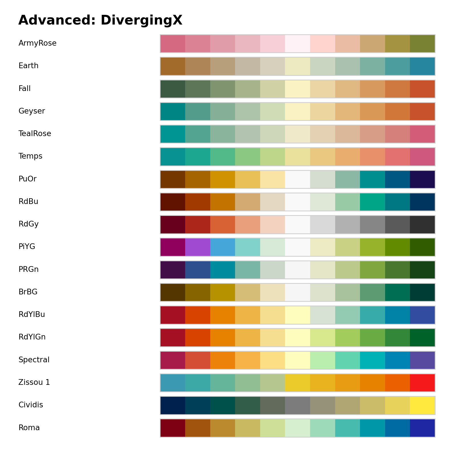
The plot below shows all such flexible diverging palettes that have been named in colorspace:
“ArmyRose” to “Tropic” closely match the palettes of the same name from CARTO (CARTO 2019).
“Zissou 1” closely matches the palette of the same name from wesanderson (Ram and Wickham 2023).
“Cividis” closely matches the palette of the same name from the viridis family (Garnier 2024). Note that despite having two “arms” with blue vs. yellow colors and a low-chroma center color, this is probably better classified as a sequential palette due to the monotonic chroma going from dark to light. (See Approximating Palettes from Other Packages for more details.)
“Roma” closely matches the palette of the same name by Crameri (2018).
Typically, the more restricted diverging_hcl palettes should be preferred because they are more balanced. However, by being able to go through light yellow as the neutral color warmer diverging palettes are available.
Harrower, Mark, and Cynthia A. Brewer. 2003. “ColorBrewer.org: An Online Tool for Selecting Colour Schemes for Maps.”The Cartographic Journal 40 (1): 27–37. https://doi.org/10.1179/000870403235002042.
Ihaka, Ross. 2003. “Colour for Presentation Graphics.” In Proceedings of the 3rd International Workshop on Distributed Statistical Computing, Vienna, Austria, edited by Kurt Hornik, Friedrich Leisch, and Achim Zeileis. https://www.r-project.org/conferences/DSC-2003/Proceedings/Ihaka.pdf.
Smith, Nathaniel, and Stéfan Van der Walt. 2015. “A Better Default Colormap for Matplotlib.” In SciPy 2015 – Scientific Computing with Python. Austin. https://www.youtube.com/watch?v=xAoljeRJ3lU.
Stauffer, Reto, Georg J. Mayr, Markus Dabernig, and Achim Zeileis. 2015. “Somewhere over the Rainbow: How to Make Effective Use of Colors in Meteorological Visualizations.”Bulletin of the American Meteorological Society 96 (2): 203–16. https://doi.org/10.1175/BAMS-D-13-00155.1.
Zeileis, Achim, Kurt Hornik, and Paul Murrell. 2009. “Escaping RGBland: Selecting Colors for Statistical Graphics.”Computational Statistics & Data Analysis 53: 3259–70. https://doi.org/10.1016/j.csda.2008.11.033.