This article shows a series of different plots and figures using the matplotlib graphics library using color maps based on the colorspace package.
Scatterplot
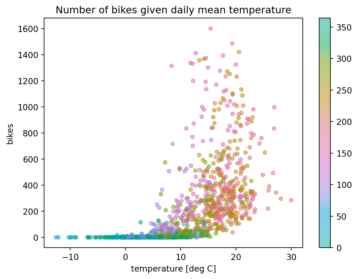
The following example depicts a scatter plot for the daily number of motorbikes (y-axis) against average daily mean temperature (x-axis), recorded on a public road in Sonnenberg in the Harz region (Germany). It is provided as a the example dataset “HarzTraffic” in the colorspace package.
The individual (x, y) data points are colored according to the day of the year (Julian day) using a circular qualitative HCL-based color palette, where blueish colors (\(\text{Hue} = \pm 180\) at the start and end of the palette) correspond to winter time and reddish colors (\(\text{Hue} = 0\)) to summer time.
from colorspace import qualitative_hcl, datasetfrom matplotlib import pyplot as plt# Loading datadf = dataset("HarzTraffic")# Circular qualitative palette pal = qualitative_hcl("Dark 3", h1 =-180, h2 =180)# Plottingplt.scatter(df.temp, df.bikes, s =20, c = df.yday, alpha =0.5, cmap = pal.cmap()) plt.colorbar()plt.title("Number of bikes given daily mean temperature") plt.xlabel("temperature [deg C]") plt.ylabel("bikes") plt.show()
Heatmap
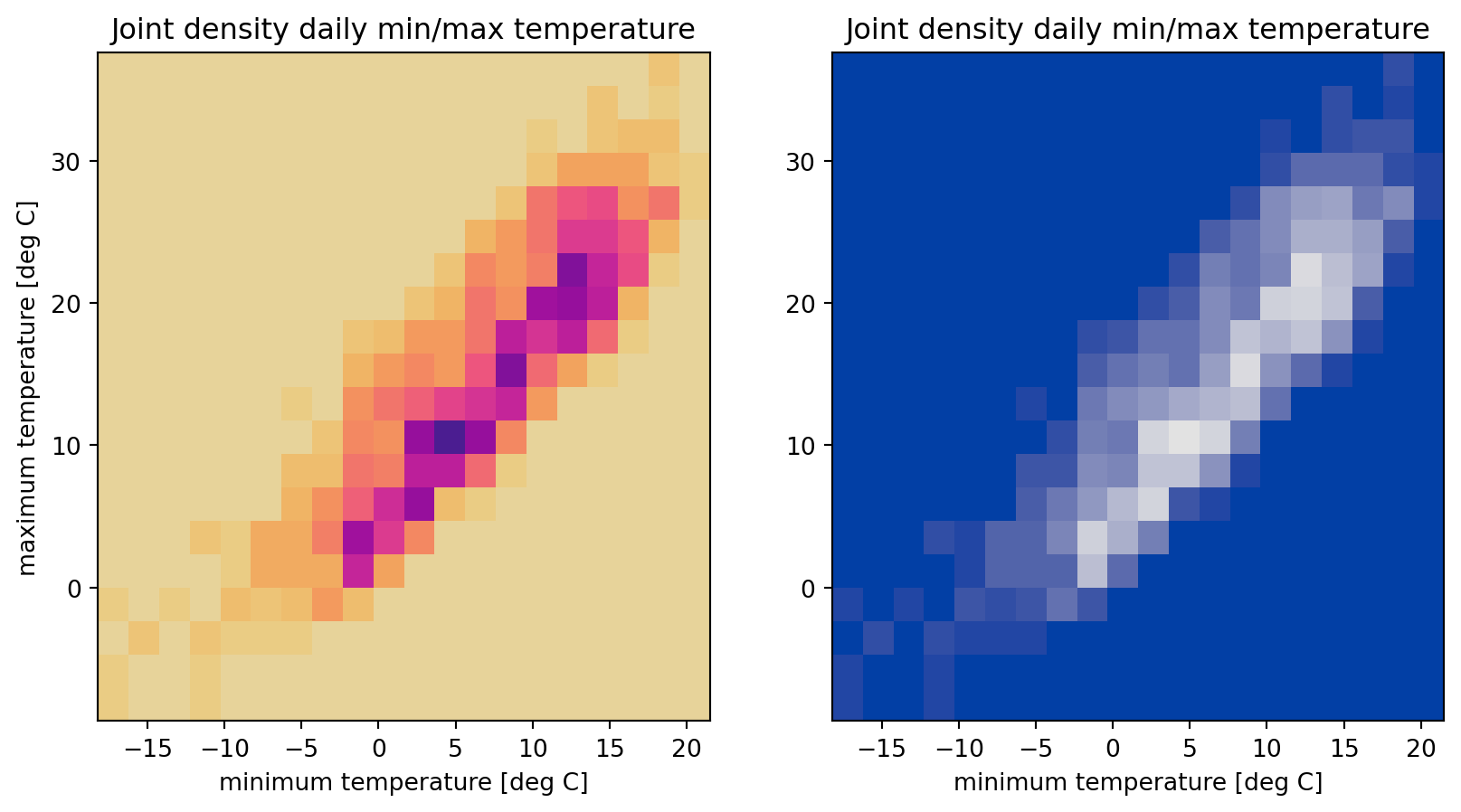
The “HarzTraffic” example data set also includes daily minimum and maximum temperatures measured at a meteorological station in the area. The following example visualizes their two-dimensional density using a heatmap. Two alternative sequential HCL-based ’cmap’s (LinearSegmentedColormaps) are created using the .cmap() method.
While the left supblot uses the sequential HCL-based color palette “ag_Sunset” (reversed), the right plot shows the same data using the “Blues 2” palette.
from colorspace import sequential_hcl, datasetimport matplotlib.pyplot as plt# Loading datadf = dataset("HarzTraffic")# Creating new figurefig, (ax1, ax2) = plt.subplots(1, 2, figsize = (10, 5))ax1.hist2d(df.tempmin, df.tempmax, bins =20, cmap = sequential_hcl("ag_Sunset", rev =True).cmap())ax2.hist2d(df.tempmin, df.tempmax, bins =20, cmap = sequential_hcl("Blues 2").cmap())# Setting title and labelsax1.set_title("Joint density daily min/max temperature")ax1.set_xlabel("minimum temperature [deg C]")ax1.set_ylabel("maximum temperature [deg C]")ax2.set_title("Joint density daily min/max temperature")ax2.set_xlabel("minimum temperature [deg C]")plt.show()
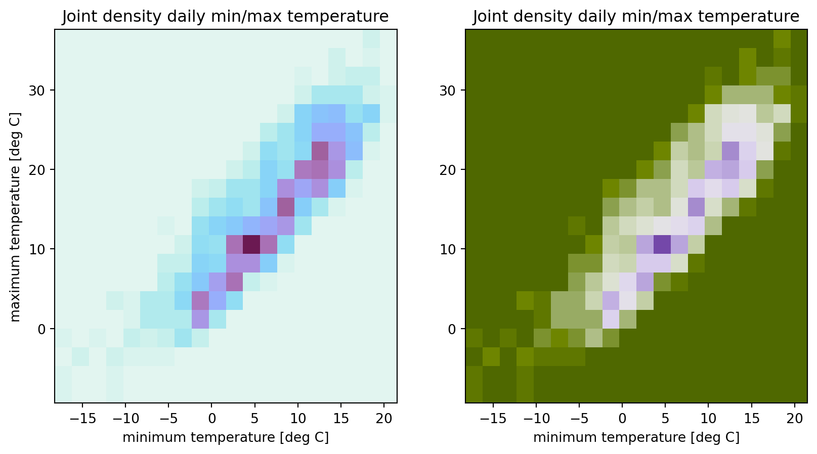
Alternatively, fully customized color maps can be created and used for plotting. The example below shows heatmaps with two fully custom HCL-based color palettes, a sequential palette (left) and a reversed diverging palette (right).
from colorspace import sequential_hcl, diverging_hcl, datasetimport matplotlib.pyplot as plt# The two fully custom HCL-based palettes to be usedcustom1 = sequential_hcl(h = [170, 330], c = [10, 70, 45], l = [95, 25], power = [1.5, 0.5])custom2 = diverging_hcl(h = [280, 100], c = [70, 50], l = [40, 90], power = [1.0, 2.0], rev =True)# Loading datadf = dataset("HarzTraffic")# Creating new figurefig, (ax1, ax2) = plt.subplots(1, 2, figsize = (10, 5))ax1.hist2d(df.tempmin, df.tempmax, bins =20, cmap = custom1.cmap())ax2.hist2d(df.tempmin, df.tempmax, bins =20, cmap = custom2.cmap())# Setting title and labelsax1.set_title("Joint density daily min/max temperature")ax1.set_xlabel("minimum temperature [deg C]")ax1.set_ylabel("maximum temperature [deg C]")ax2.set_title("Joint density daily min/max temperature")ax2.set_xlabel("minimum temperature [deg C]")plt.show()
Three-dimensional surface
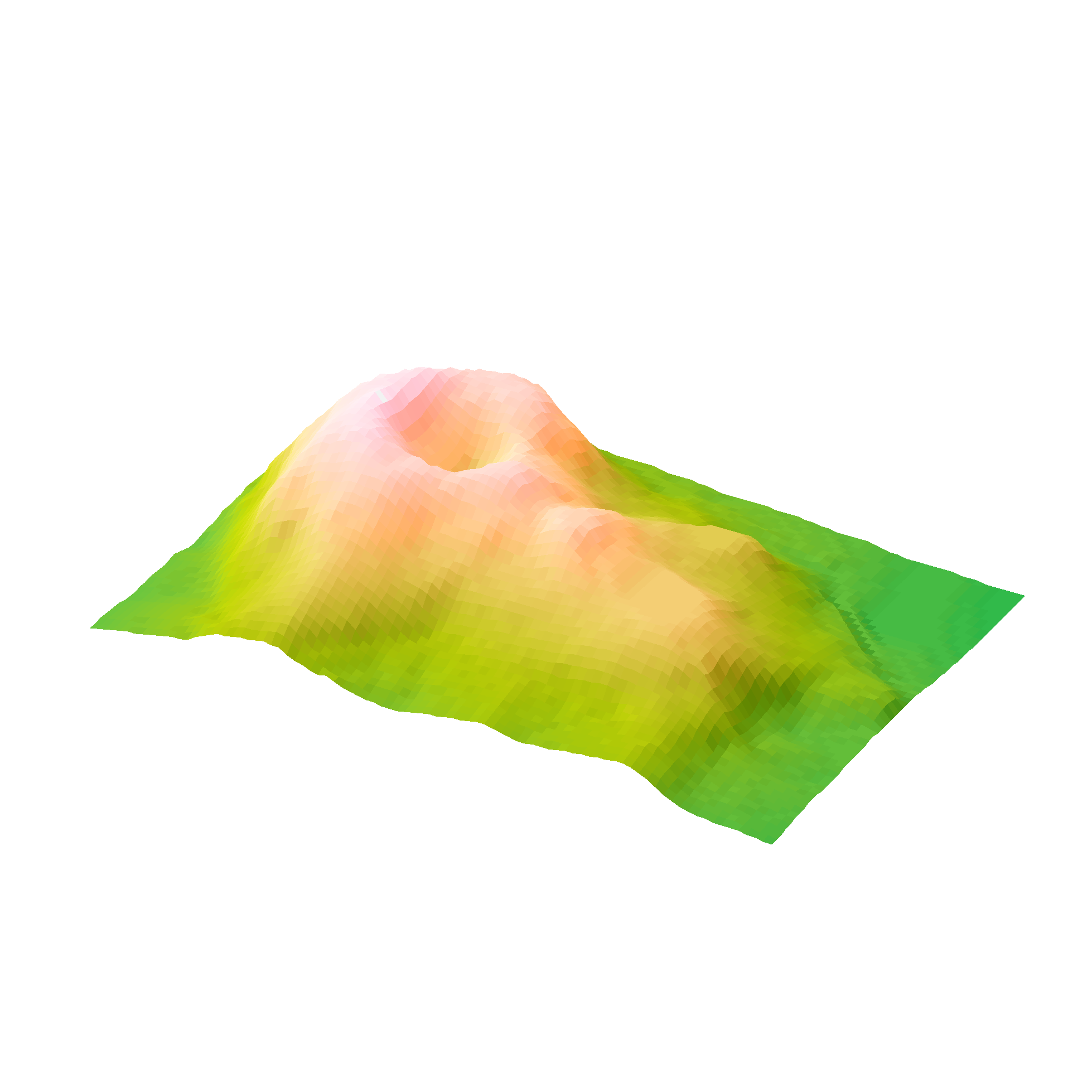
Finally, the example below shows the topographic data of Maunga Whau (Mt Eden) located in the Auckland volcanic field on a 10m by 10m grid using the HCL-based terrain color palette, a multi-hue sequential palette.
from colorspace import terrain_hclfrom colorspace.demos import get_volcano_dataimport matplotlib.pyplot as pltfrom matplotlib.colors import LightSourceimport numpy as np# Loading data setvolcano = dataset("volcano")# Palette to be usedpal = terrain_hcl()# Loading vulcanodata = get_volcano_data(True)Y = np.linspace(1, data.shape[0], data.shape[0])X = np.linspace(1, data.shape[1], data.shape[1])X, Y = np.meshgrid(X, Y)fig, ax = plt.subplots(subplot_kw ={"projection": "3d"}, figsize = (10, 6))ax.set_axis_off()ax.set_box_aspect(aspect = (data.shape[1], data.shape[0], data.shape[0] /3))fig.subplots_adjust(left =0, right =1, bottom =-.4, top =1.6)# Create/calculate facing colors using custom shadingls = LightSource(270, 45)fcolors = ls.shade(data, cmap = pal.cmap(), vert_exag=0.1, blend_mode='soft')surf = ax.plot_surface(X, Y, data, rstride =1, cstride =1, facecolors = fcolors, linewidth =0, antialiased =False, shade =False)plt.show()